UX Case Study: Fetch Rewards Spinoff
Background
Fetch Rewards is a loyalty app that rewards a shopper’s grocery purchases with points that they can later swap for additional benefits like gift cards and digital cash, or just use to donate.
What sets Fetch apart from many other rewards apps is that you can scan both physical and digital receipts. Plus, quick and easy setup, and no annoying surveys.
When the pandemic took hold, the firm disclosed that it saw massive growth in its business with a 25% increase in food retail revenue. The company also reported that revenue grew by 30x from 2017 to 2020. Fetch Rewards is currently ranked 116th on Inc’s 5,000 fastest-growing private companies in the US.
The Objectives of This Case Study
I want to remake Fetch Rewards’ whole purpose as a library of all your purchases. An app that can keep track of all your orders, tell you where you spend your money, and be able to buy stuff from the app.
The Process
Survey
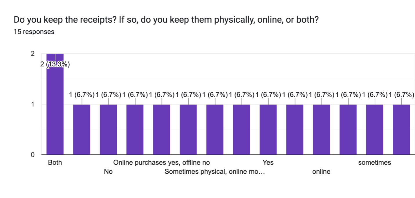
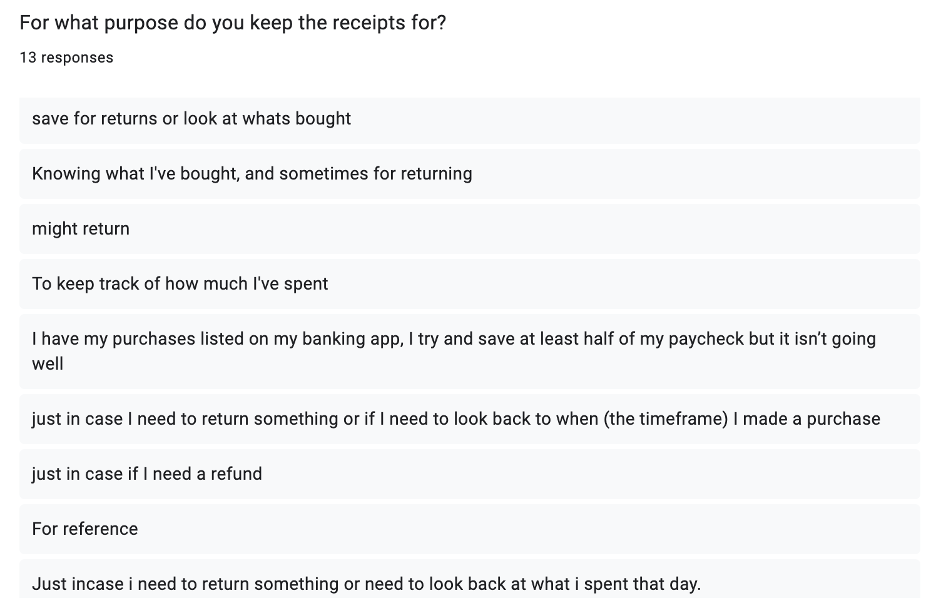
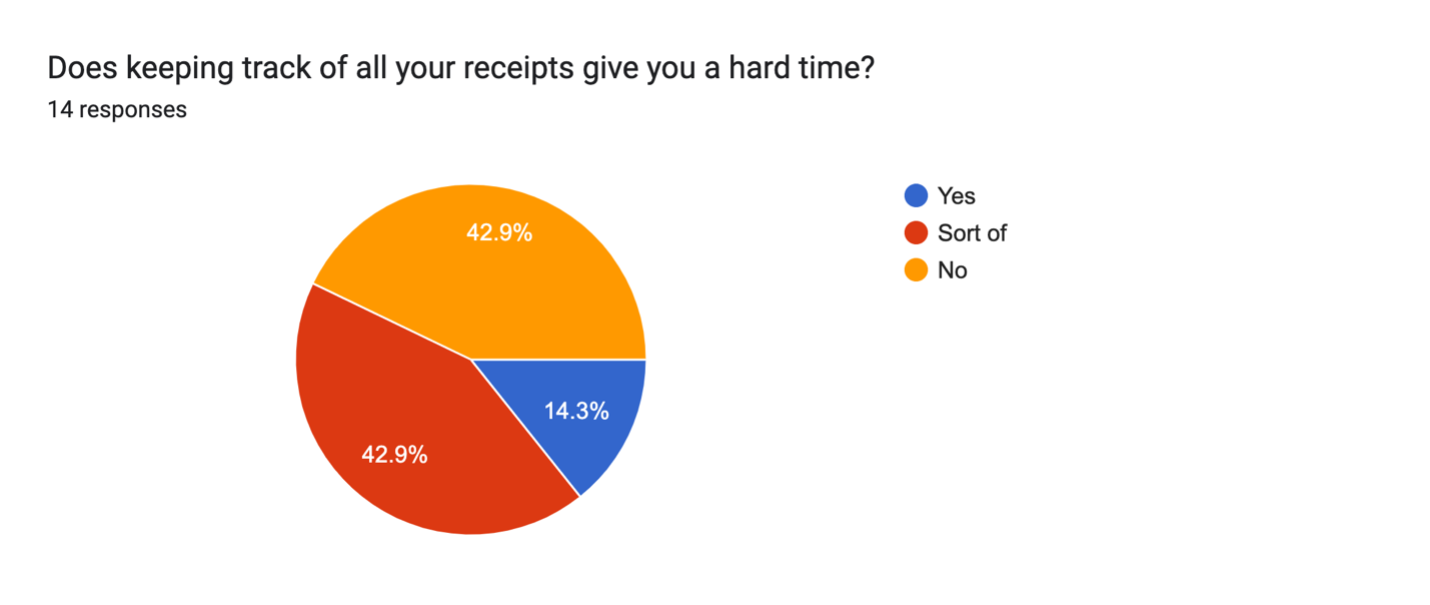
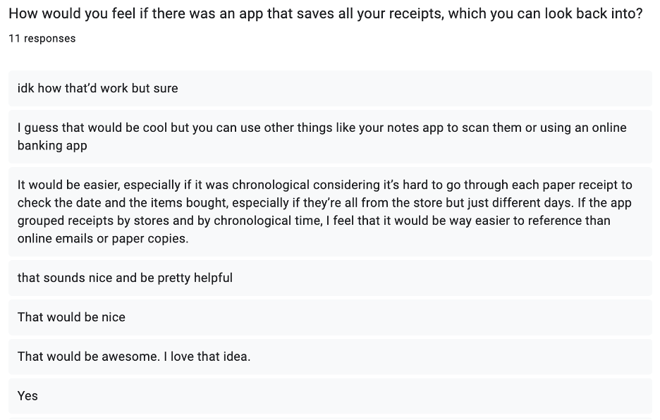
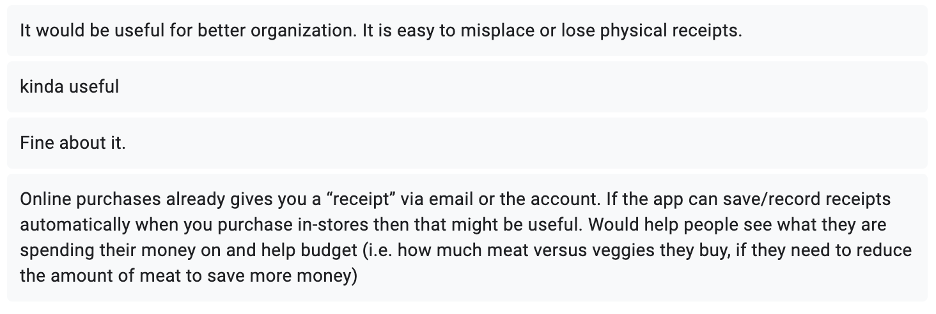
The survey received 15 responses and the main findings were:


User Personas
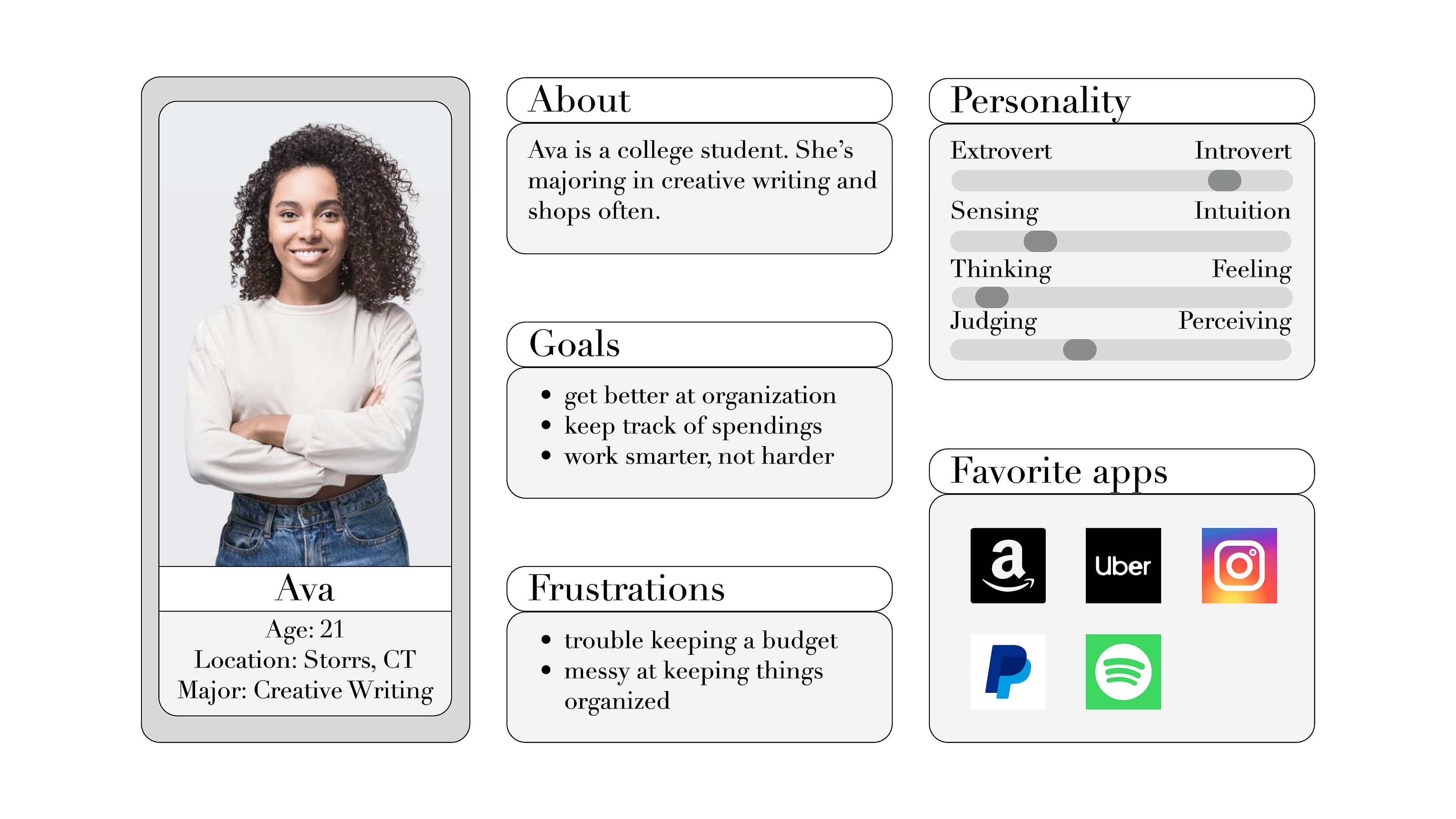
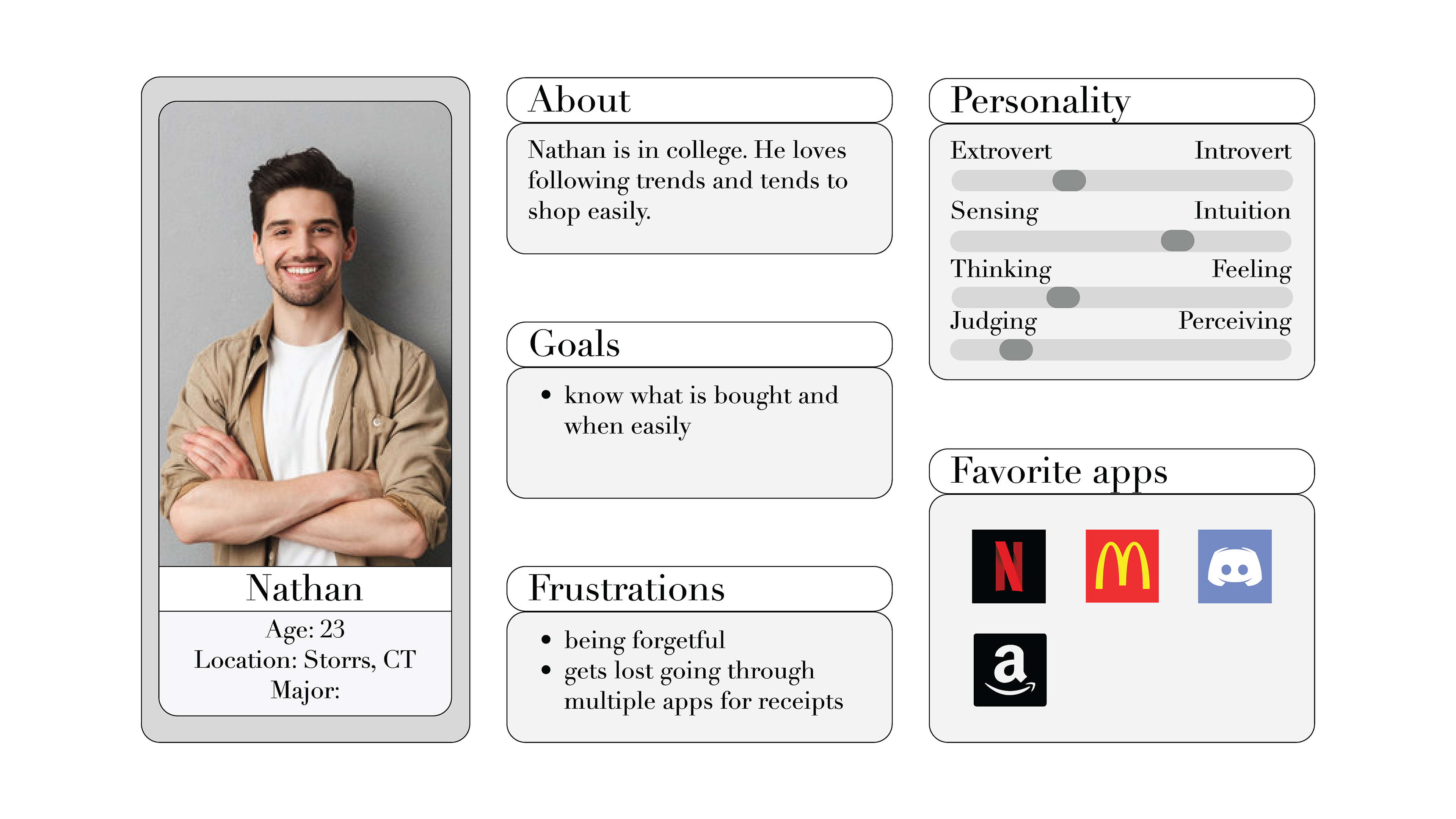
I created two user personas from the results of the survey. This helped me figure out what the users wanted, their goals, and whom I’m designing the app for. This part was a bit hard to figure out at first.
User Stories
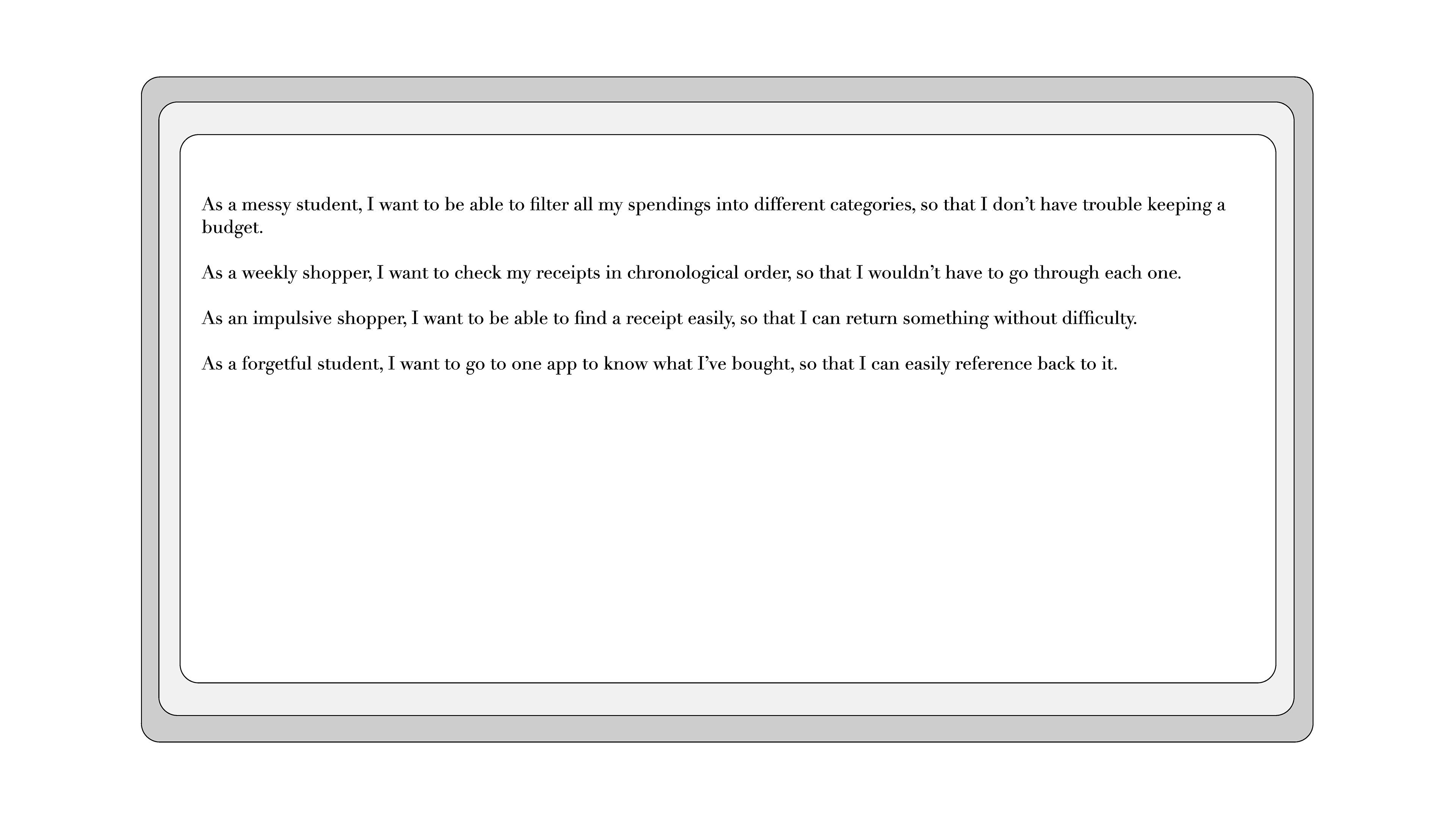
The stories helped me prioritize what I need to design for the users to accomplish their goals, define the app’s features and how they’ll be used, and include the ‘why’ for my goals for everyone to understand the purpose of the story.
Paper Wireframe
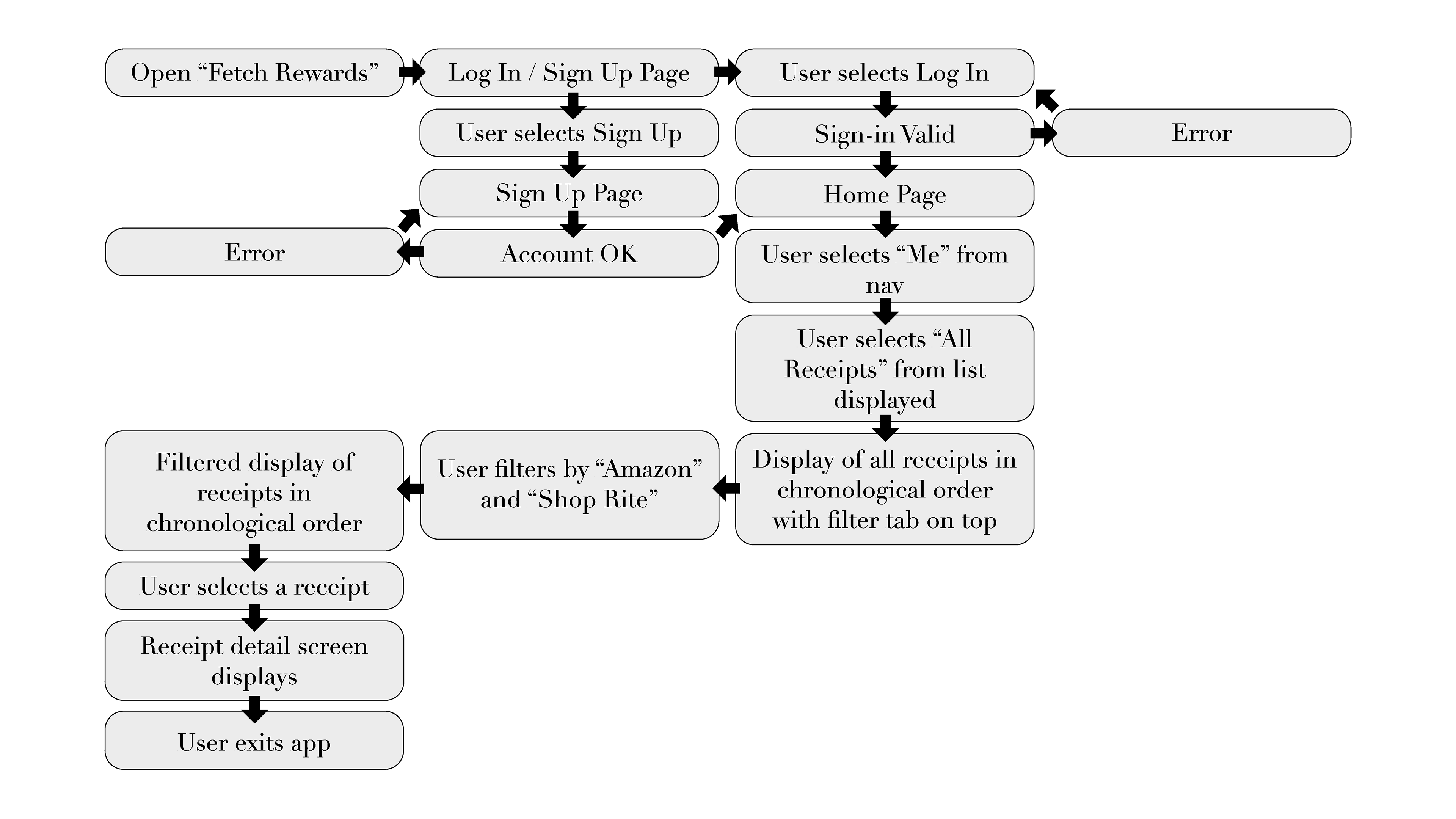
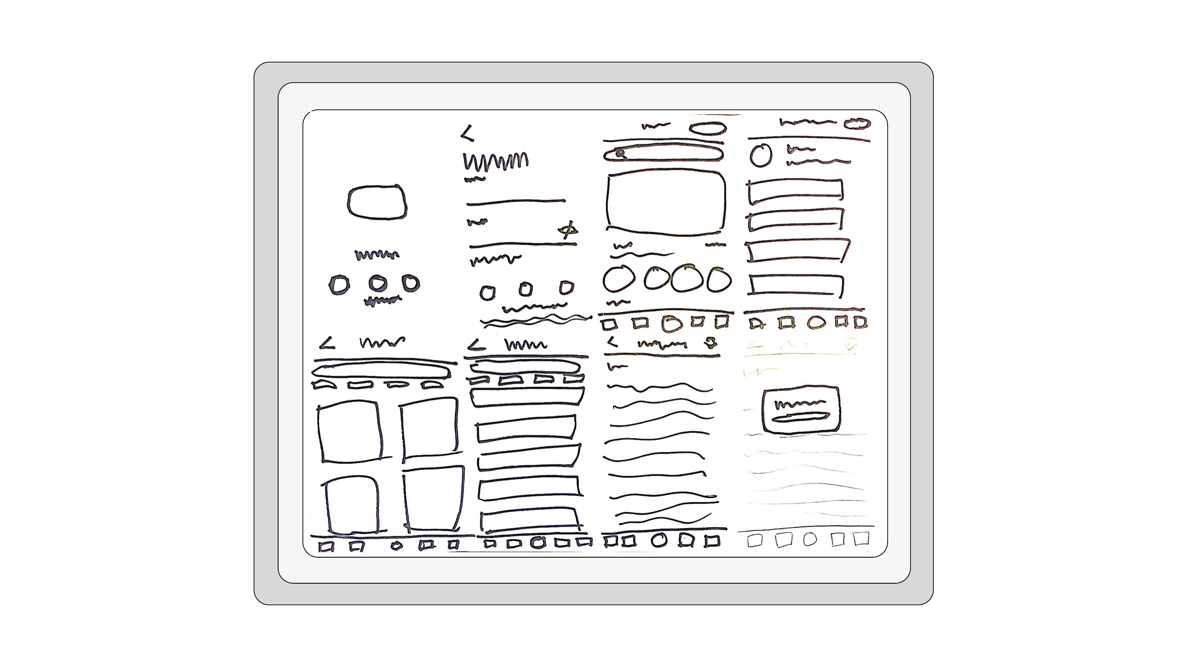
My sketches and plans will represent the user flow chosen. I took some inspiration from the original app’s style and then tried to use that style to design the “receipts” section.
Low-Fidelity Wireframes
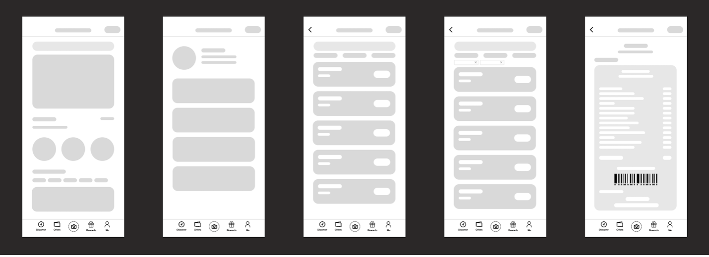
The digital version of my paper wireframes, it was helpful to see what possibilities that app’s features could look like. I used different shades of grey to differentiate the hierarchy of some buttons or information.
High-Fidelity Wireframes
More accurate representation of the content and organization of the lo-fi wireframes. Easier to see what could work and what couldn’t. This part of the process was probably the hardest as I wasn’t used to using Figma.

Visual Interface Design
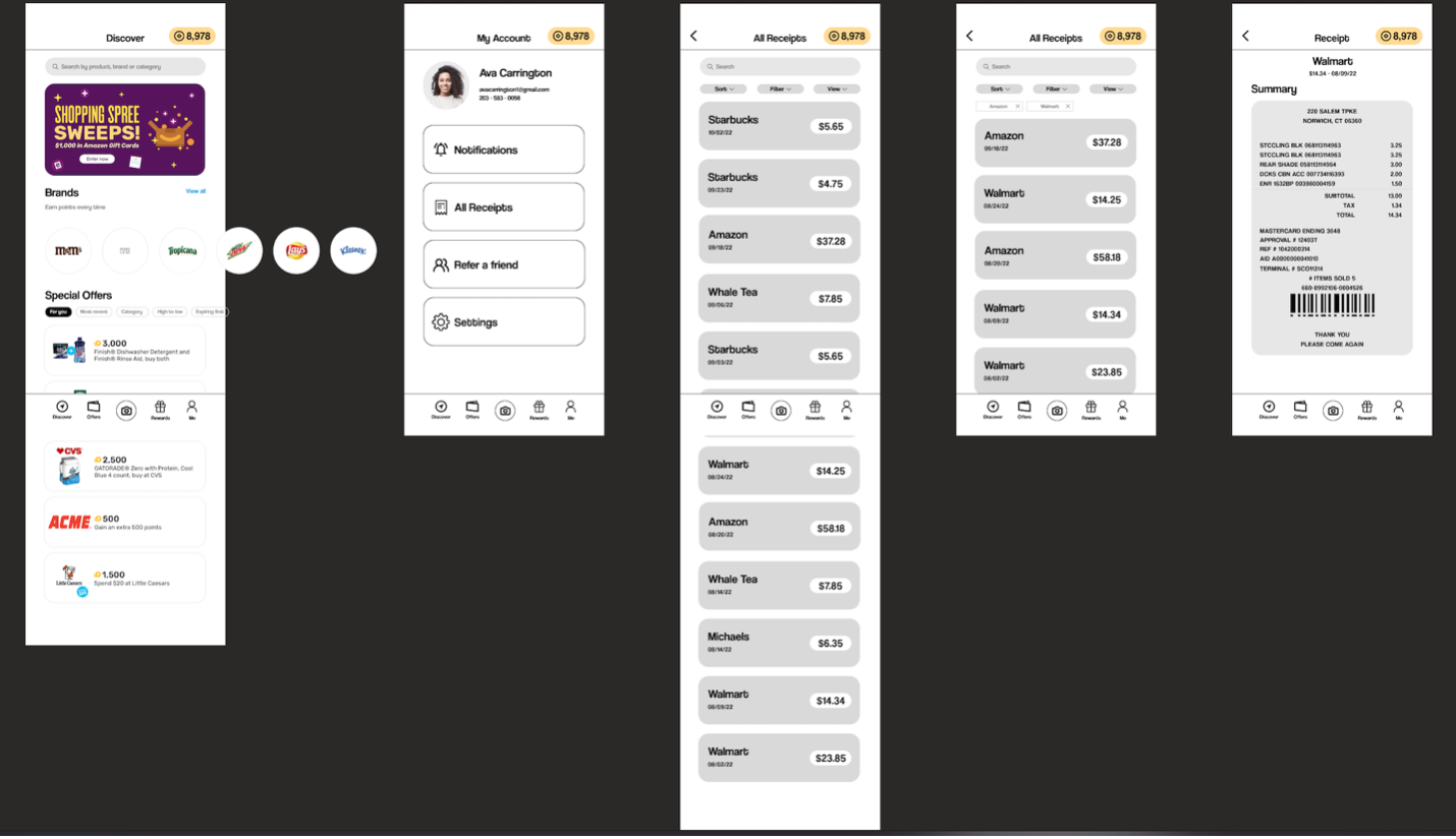
There are the final designs, and all text and imagery are included. I did a lot of color combinations, but overall, I liked the simplistic black and white and only kept the points displayed colored.
Prototyping
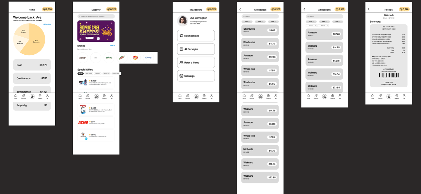
Lastly, I created usable prototypes in Figma that uses animations, demonstrating movement through the app. Some change I’ve made at this point was to create a new home screen as the original ‘Discover’ page didn’t really connect much with the purpose of this case study. The new home page shows a pie chart of the most recent monthly expenses as well as more information about the user’s cash, credit card, investments, and property.
I’ve decided to keep the ‘Discover’ page as another usable screen, replacing the ‘Offers’ page in its position.
