UI Case Study: Craigslist Redesign
Background
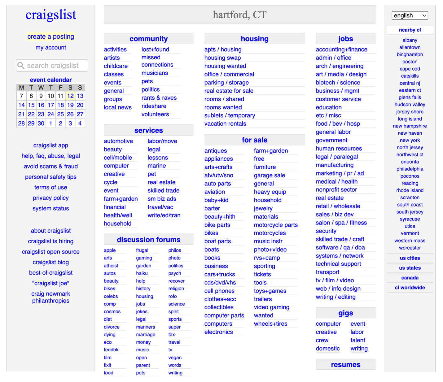
Craigslist’s web design has not changed over the years, it is still useful, but the visuals overall can be overwhelming and confusing.
The Objectives of This Case Study
I’d like to redesign Craigslist to be easy to use and visually pleasing while keeping its original style.
The Process
Competitors & User Flows
First, seeing what competitors had and didn’t have was helpful in seeing some hidden flaws that Craigslist displays. Then figuring out the website’s primary user flow tells me how many pages I need to create and think about.
Mood Boards
I created three mood boards to see what possibilities I could work with and tried to keep each one different from the others.
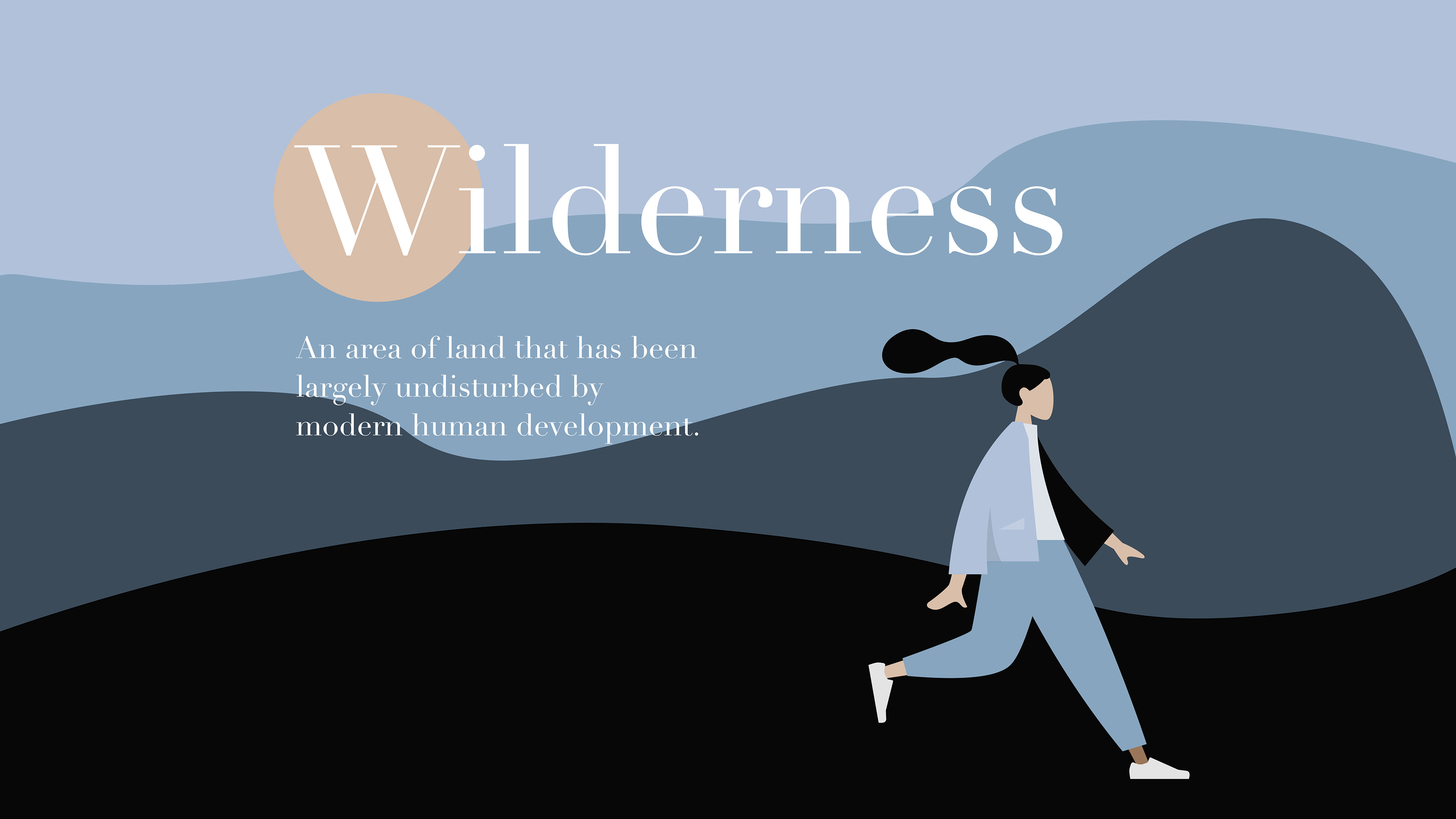
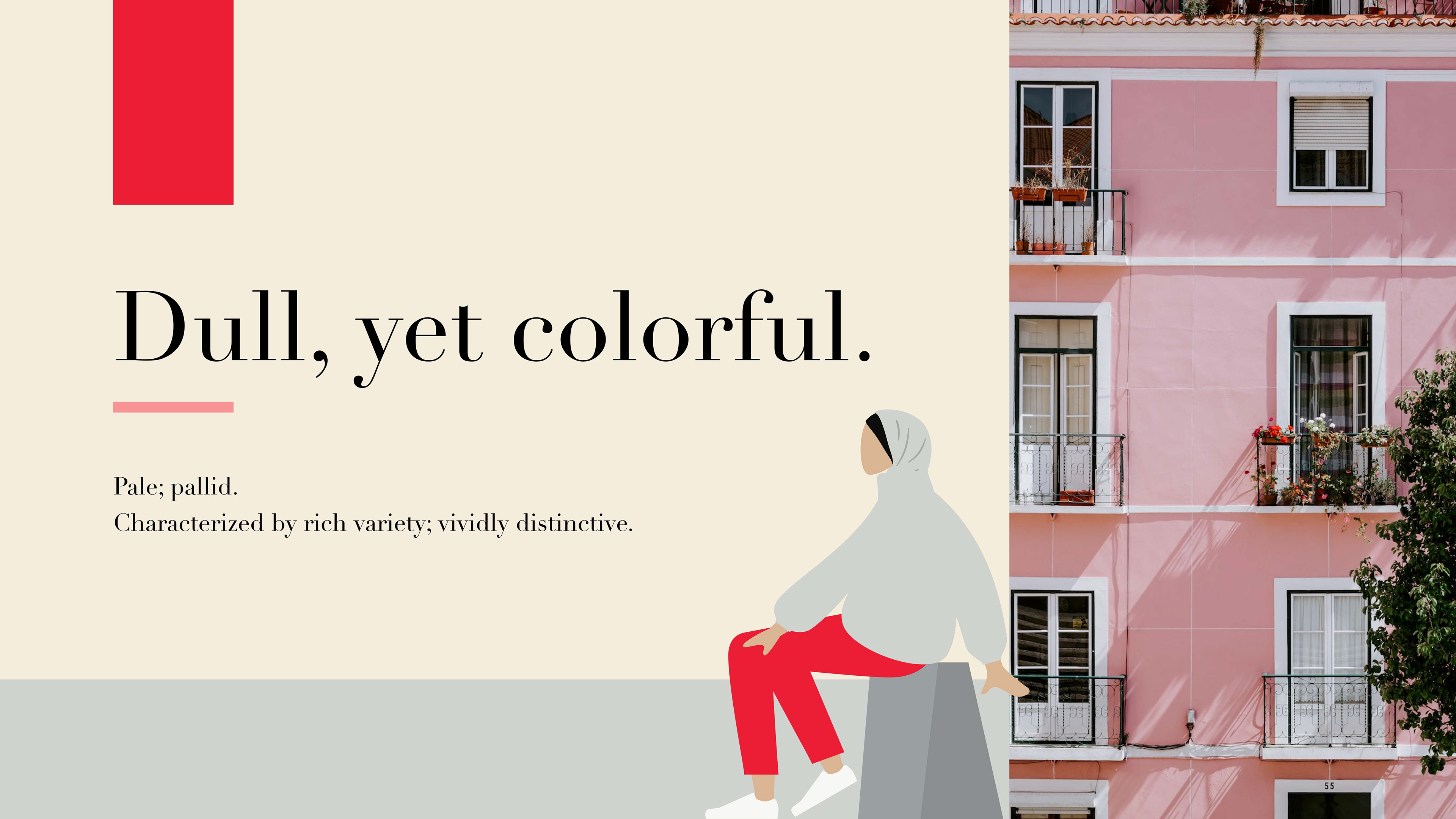
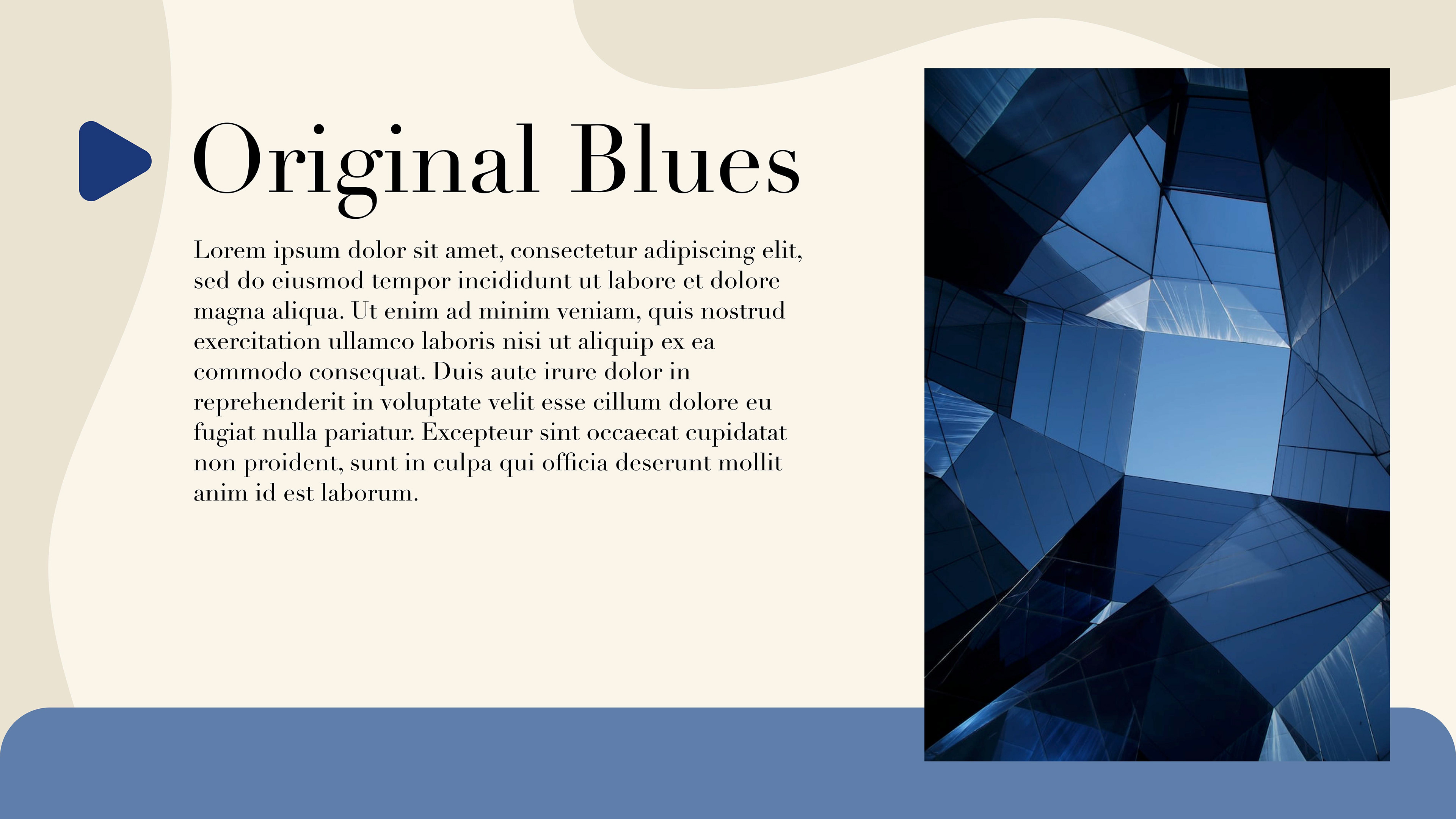
I chose the last mood board because I felt like it fit my goal of this redesign the most. Also, the fact that the colors were close to Craigslist’s colors.
Paper Wireframe
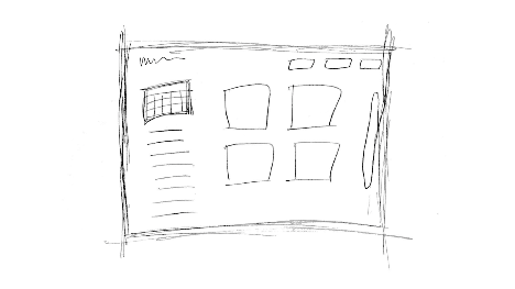
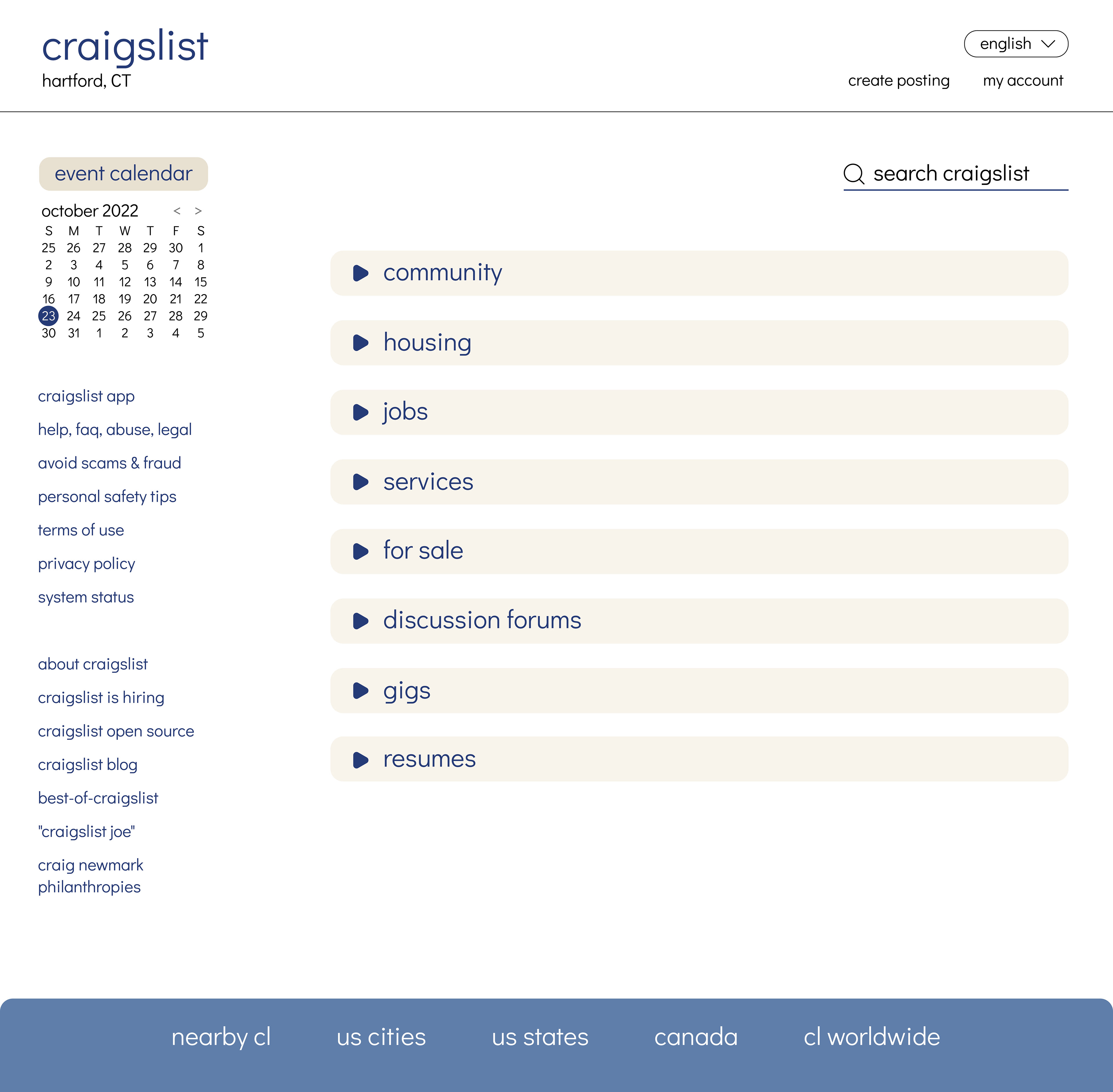
I mostly thought about the home page as it is the first thing you see on a website. The idea I had was to have these boxes that organized the lists that were sort of in your face on Craigslist’s home page.
Visual Interface Designs
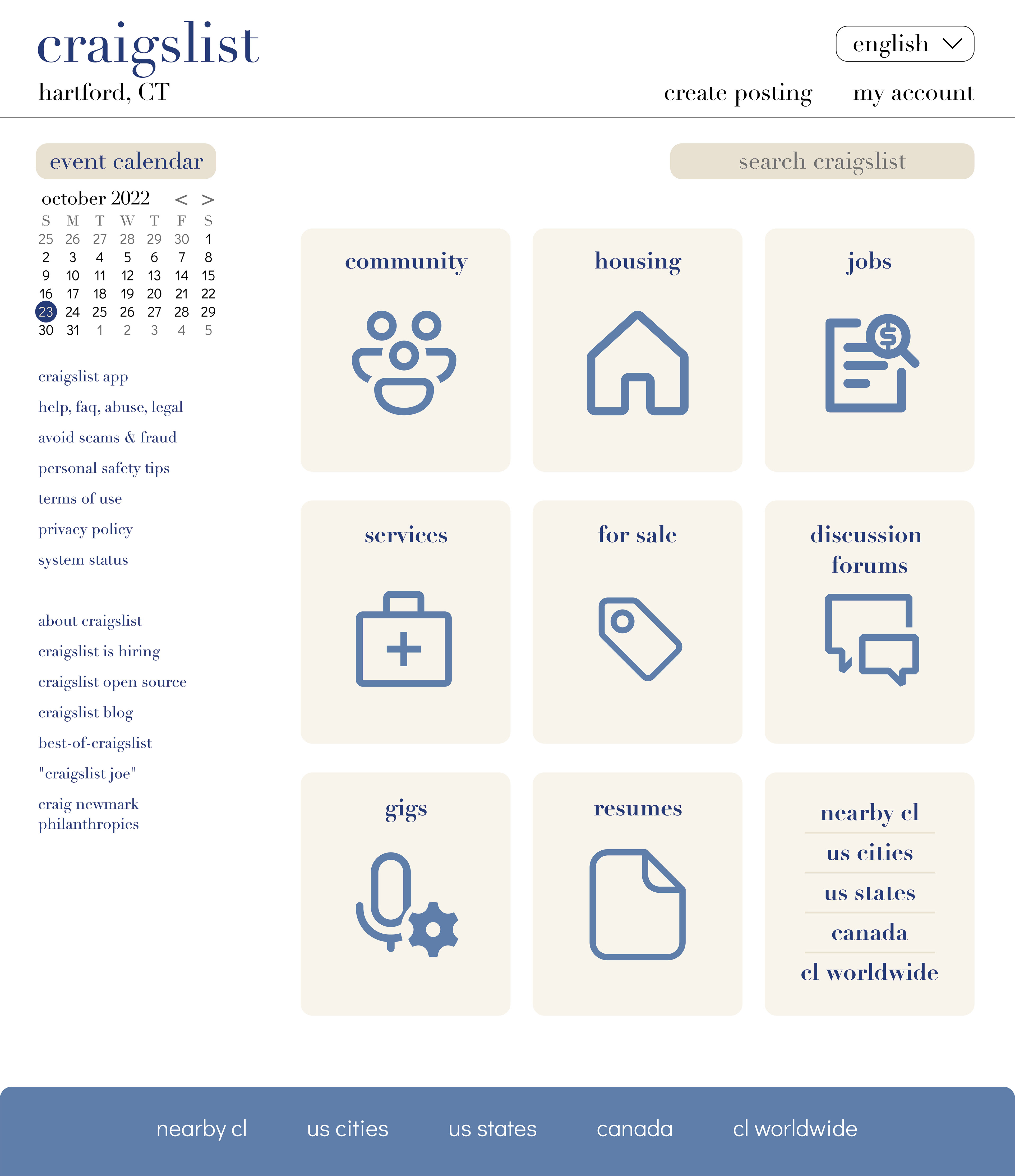
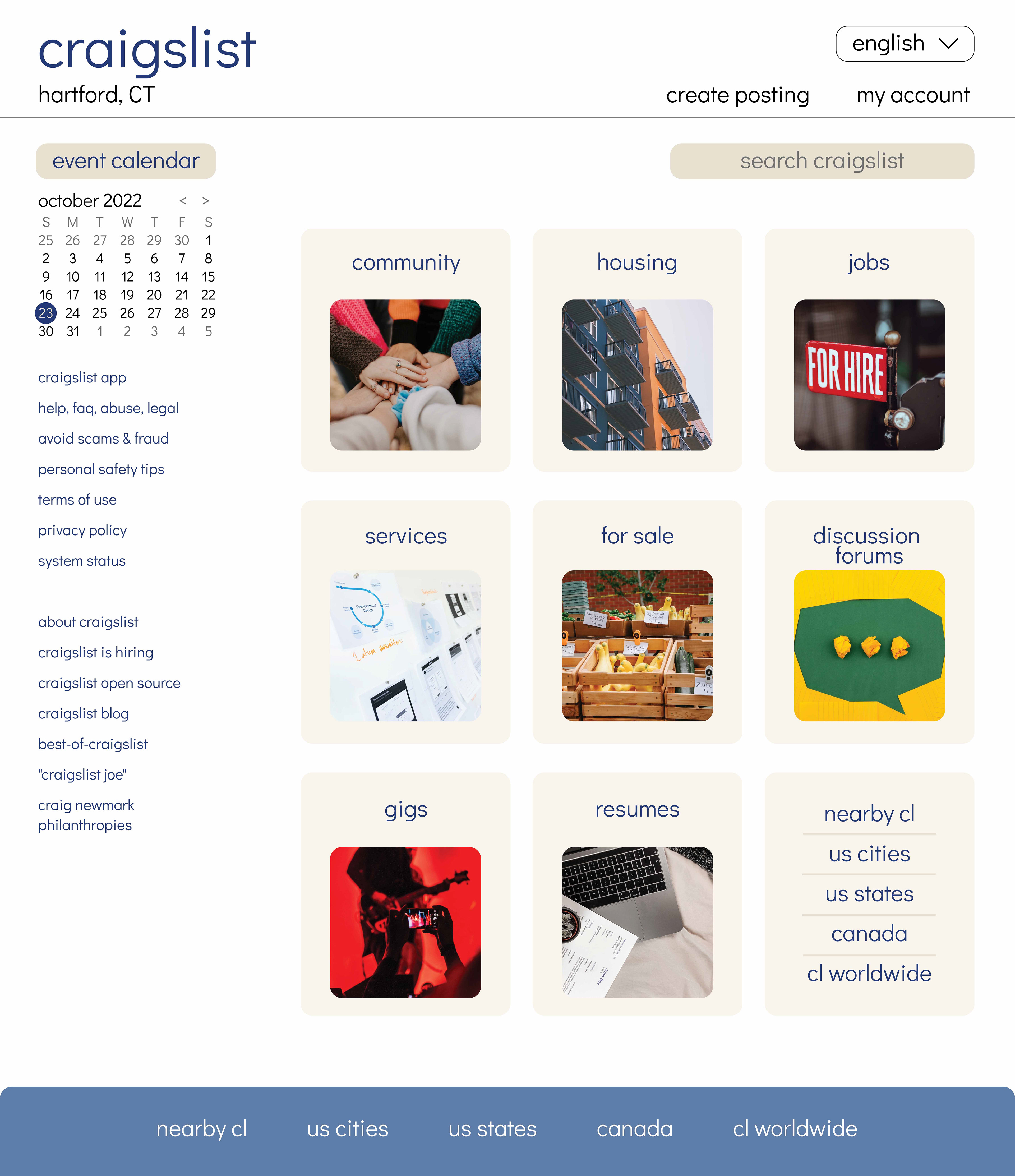
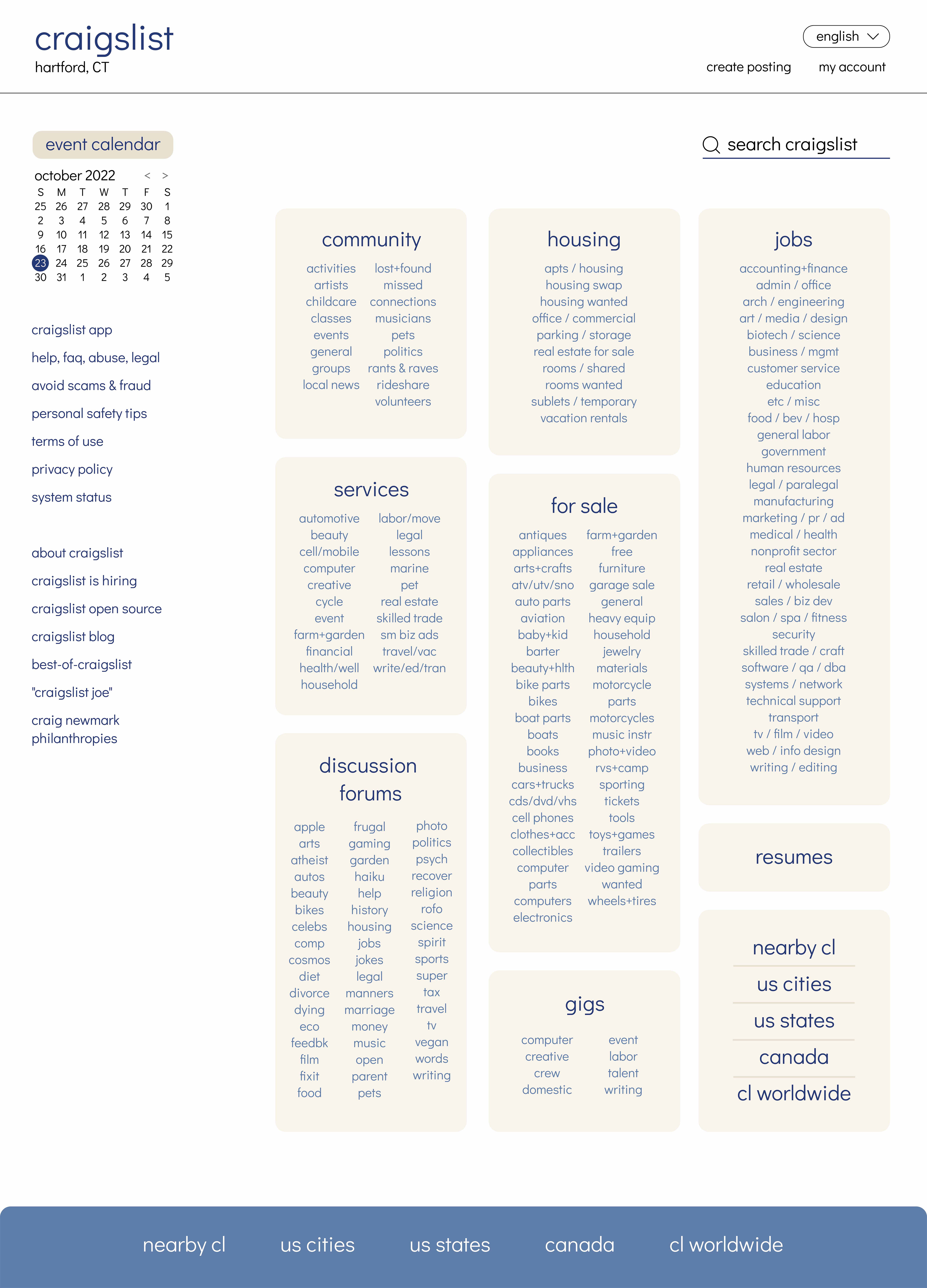
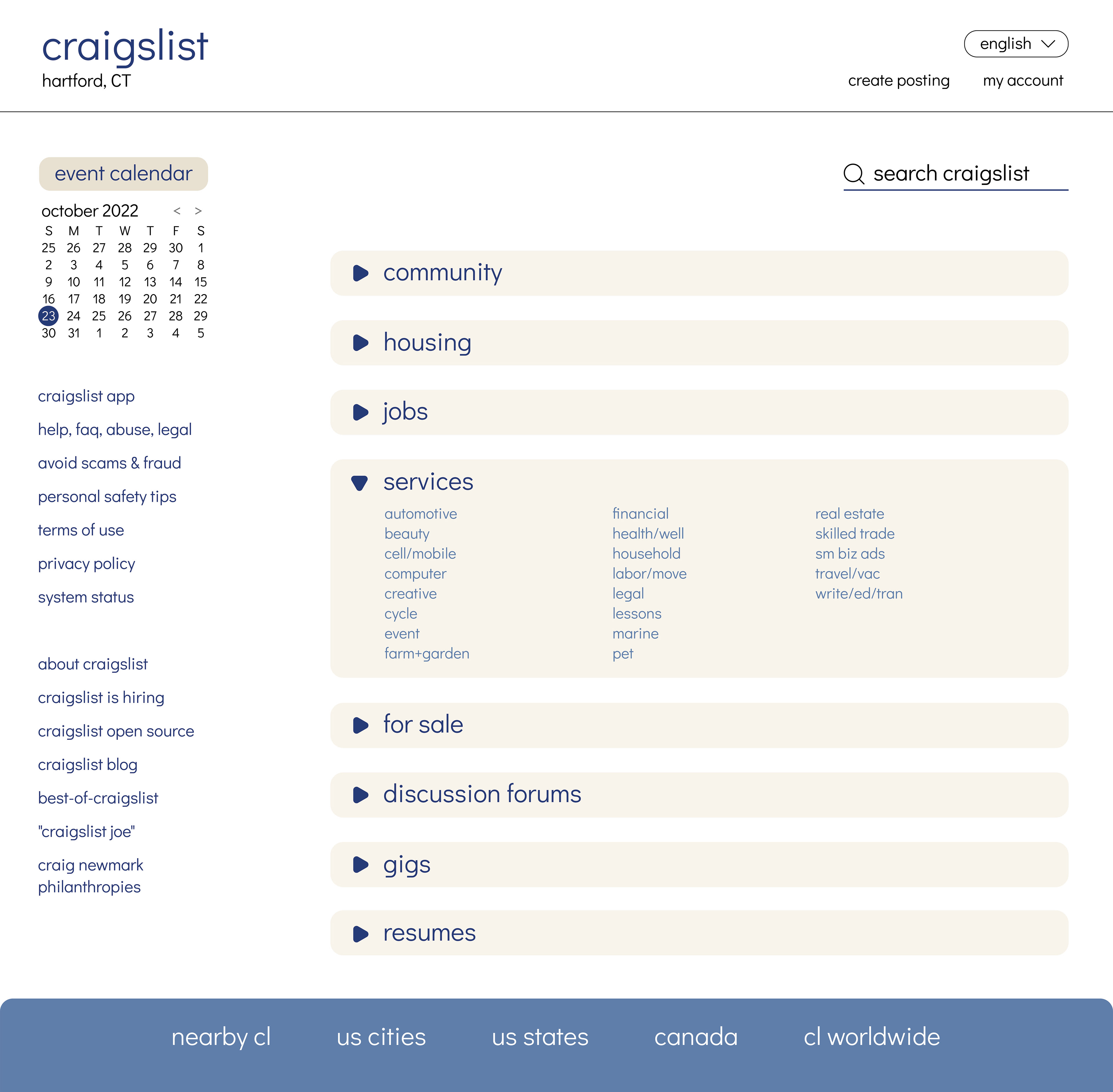
I went for a few homepage designs, working from one to another, trying the improve the previous one. In the end, I chose the drop-down boxes because it gives some interaction with the user, they can choose to see more info on what they want to see, and is easier on the eyes to look at.
Prototyping
In the last step, I designed more pages that followed the user flow with the homepage design in mind.
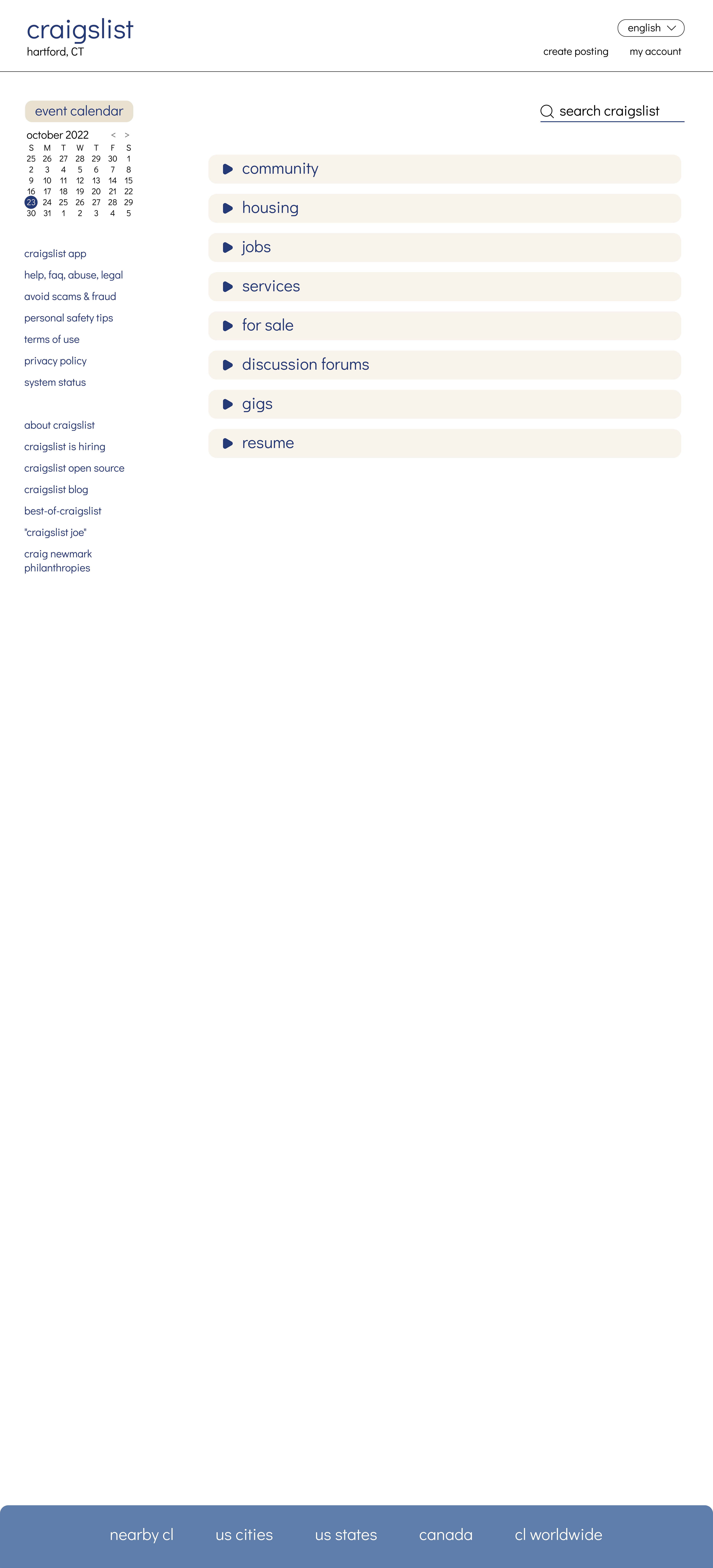
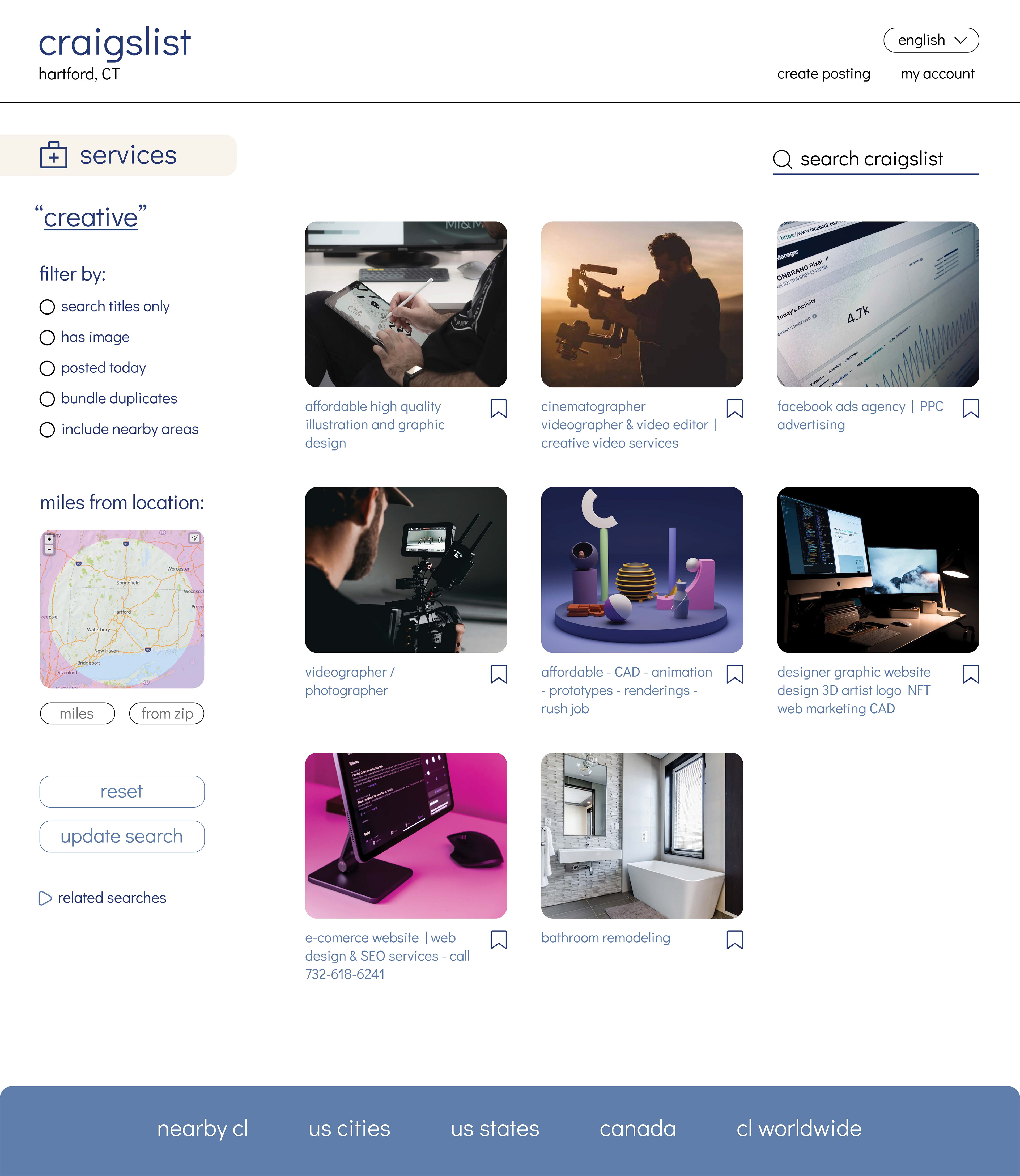
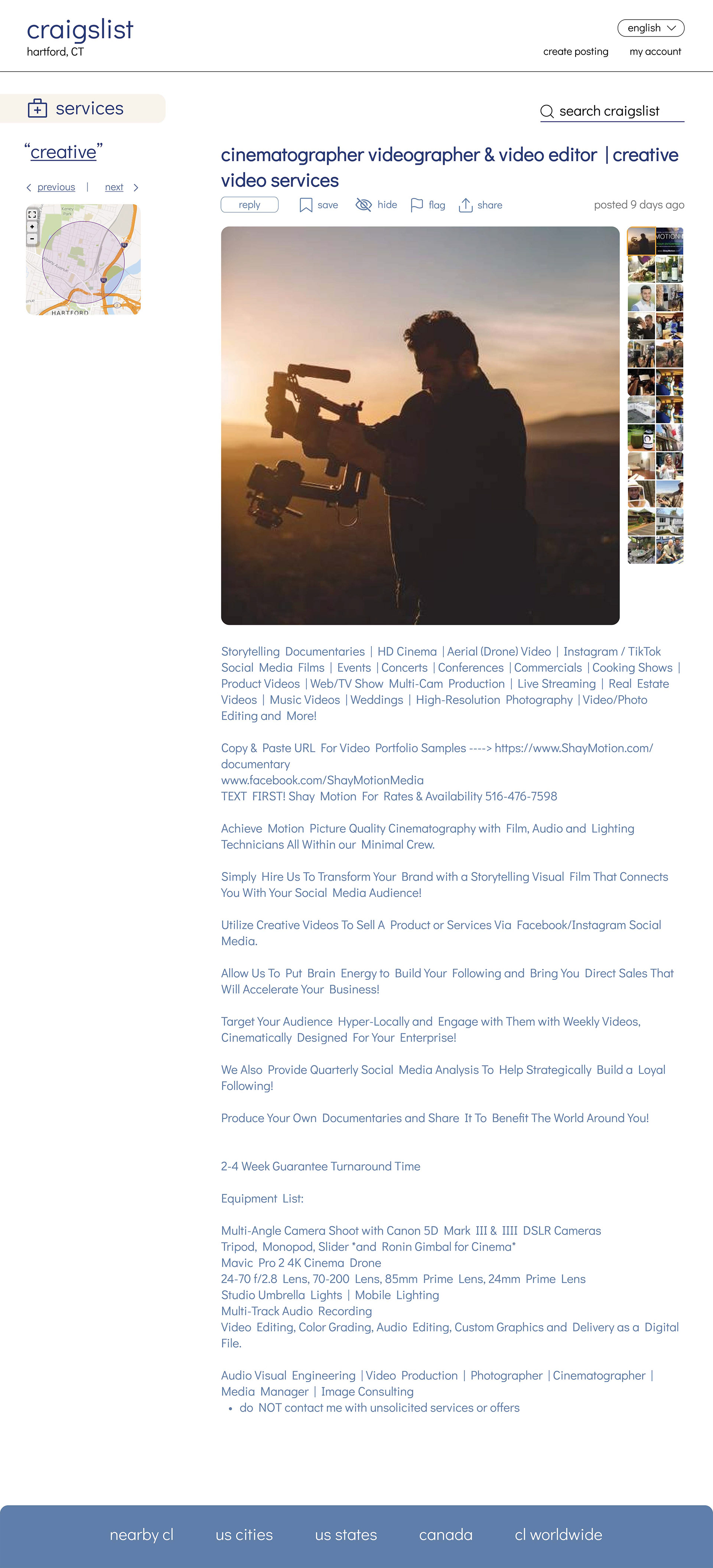
I tried to make them all look like they belonged to the same style, and again, visually pleasing, and easier to use. In some ways, I feel like I achieved that. Although I wish I could have thought of a better way to improve the informative text on the third page, it didn’t seem like text hierarchy was appropriate for it, maybe I could have done some colored banners to help separate the info as it can get boring to see long texts all looking the same format. Overall, the prototyping was relatively easy, I only did the instant clicks because most websites have that transition rather than slide transitions. The toughest part was probably making the drop-down boxes work.
Link to the Prototype